Who Eats Art
Branding
Identity Design
Art Direction
Typography
Image-making
Project Type
Branding & Identity System
Commissioned by
Gong Hua, Artist / Founder of Who Eats Art
Year
2025–2026
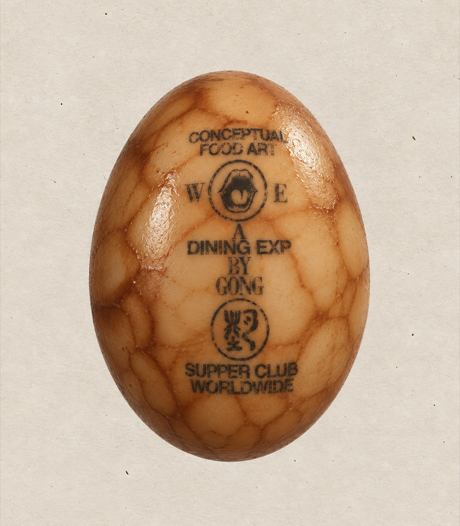
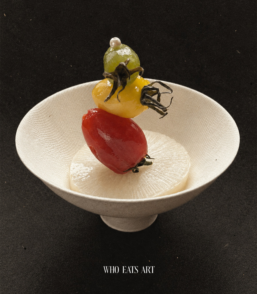
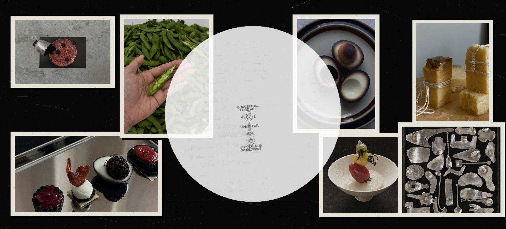
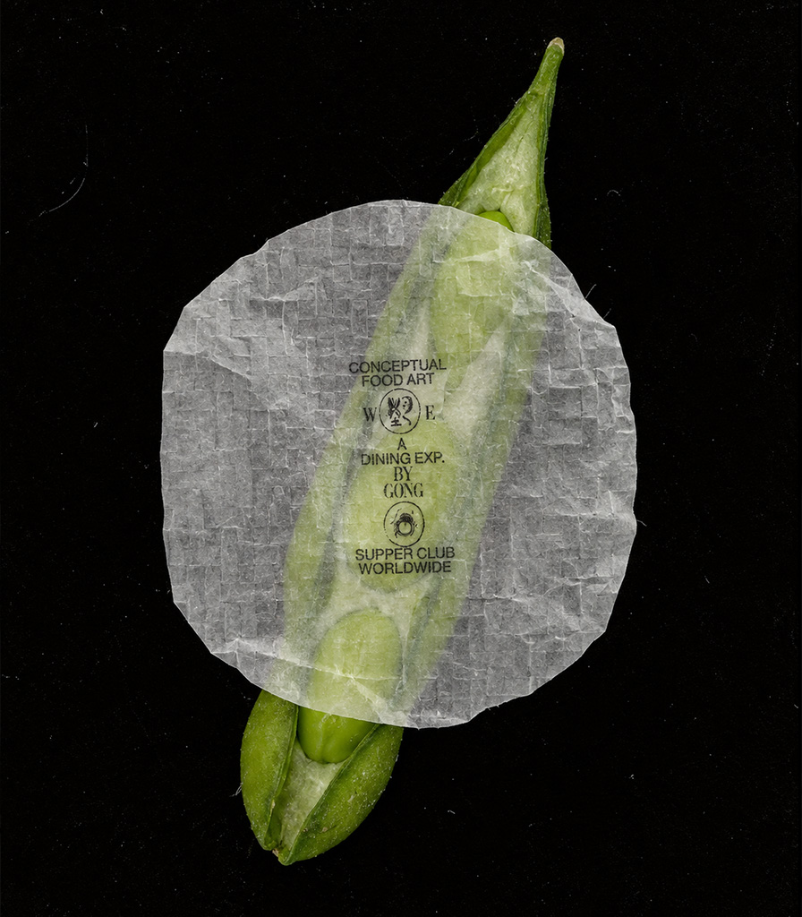
Who Eats Art is a conceptual food art and dining experience brand built around the idea that taste, language, and memory can be fused into a single sensory identity. The brief was to create a logo and identity system rooted in tension: Who Eats Art feels tough and tender at the same time. Like something made by machine, but touched by teeth. The contrast between precision and appetite, restraint and provocation, and the relationship between clean form and a more visceral, bodily experience became the core of the brand.
Inspired by traditional Chinese calligraphy, seal script, and the tactile qualities of handmade marks, the system explores how a brand can feel both rooted in heritage and sharp enough for contemporary culture. The result is a visual language that balances duality and juxtaposition—echoing the artist’s practice in food art while giving the brand an immediate, sensory presence grounded in appetite, craft, and performance.
① Where it started
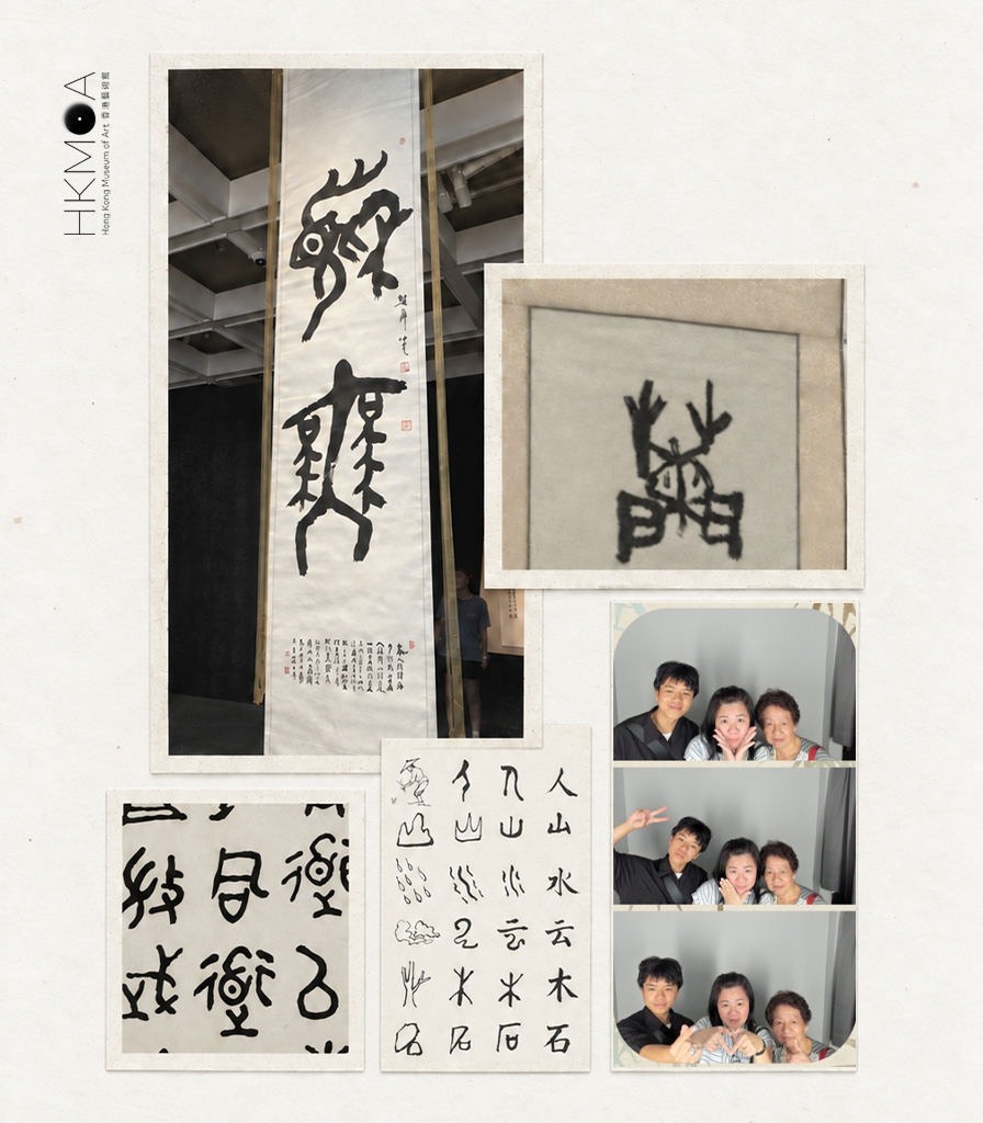
The starting point for the visual language came from a visit to the Hong Kong Museum of Art, and a series of calligraphy works there. Some of the characters were written in a deliberately impressionistic way—abstracting the Hanzi into forms that felt almost pictorial.
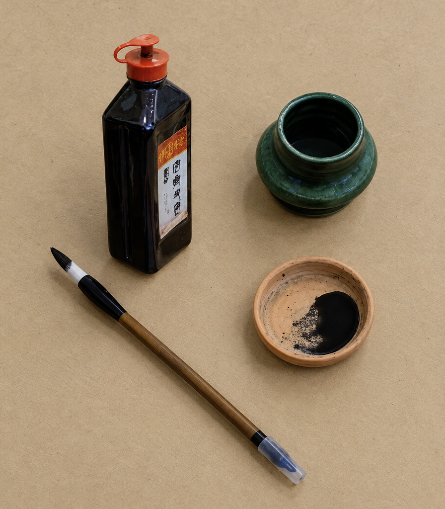
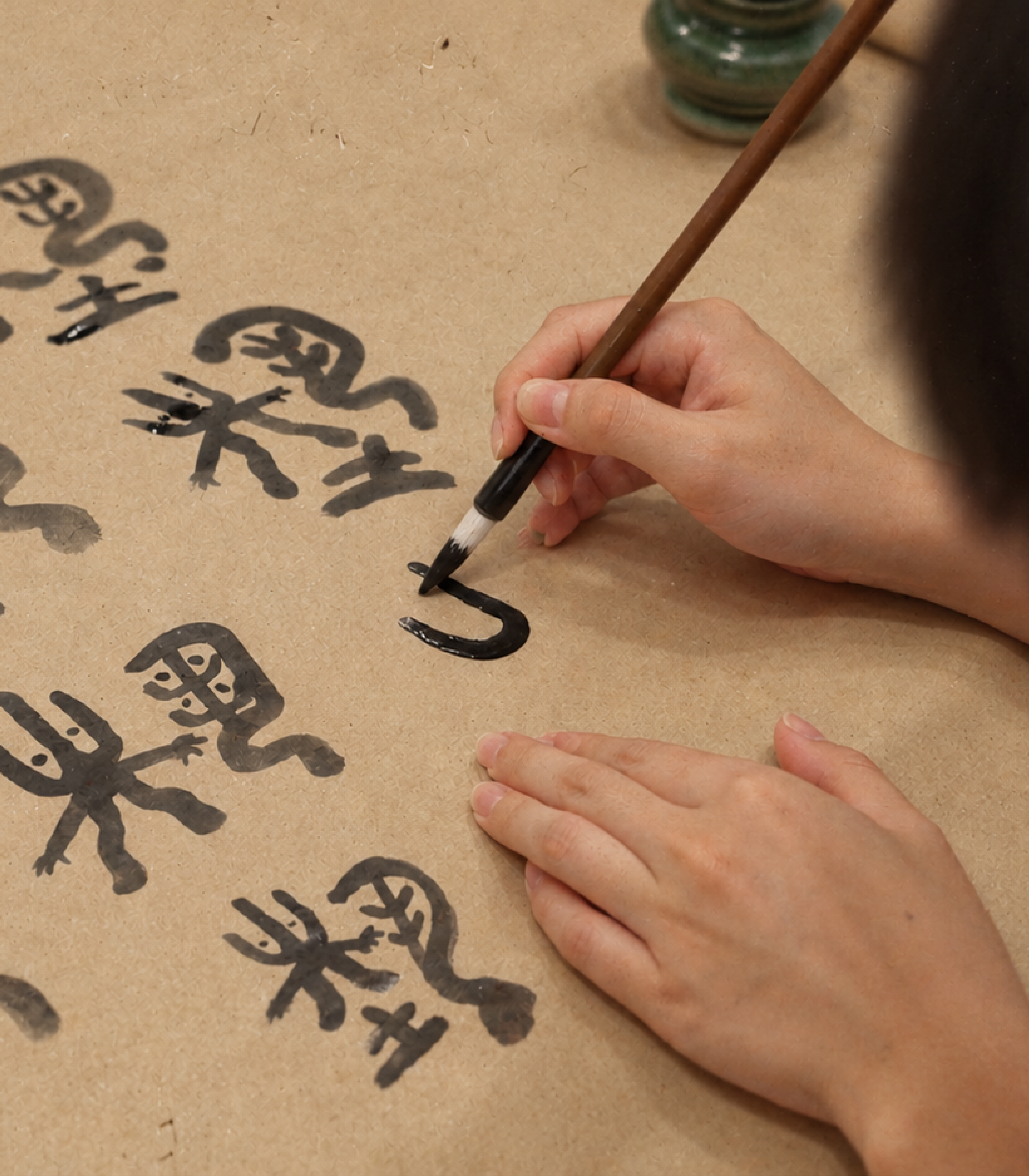
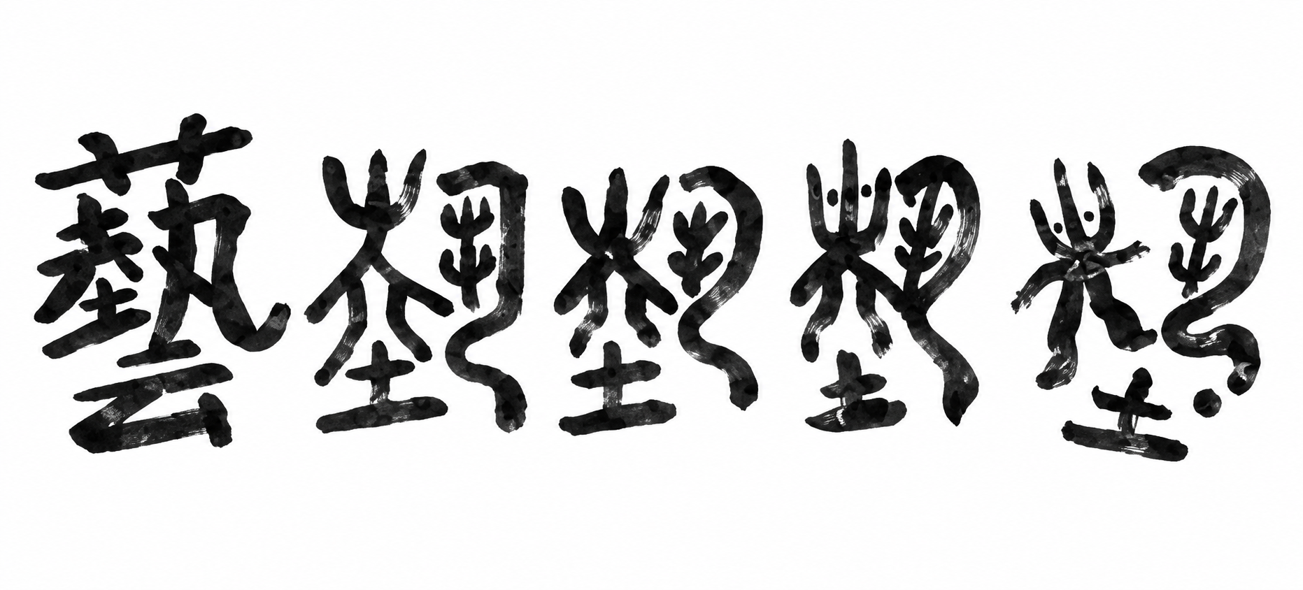
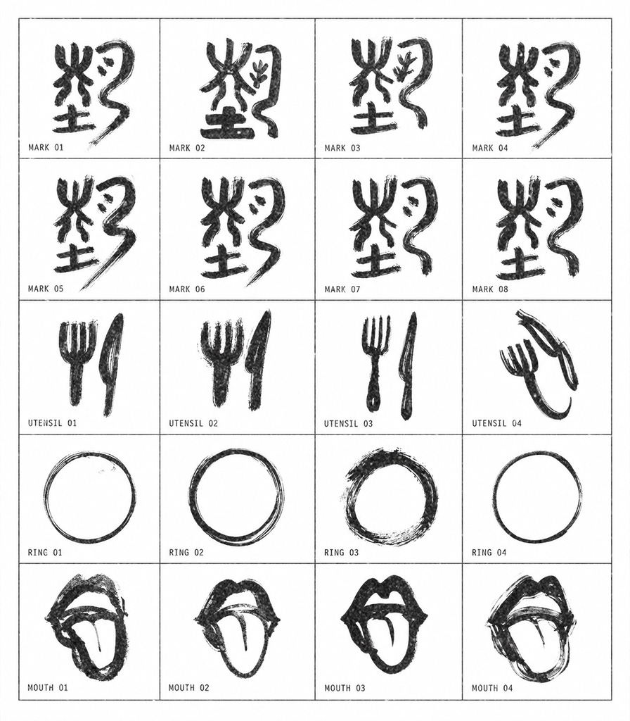
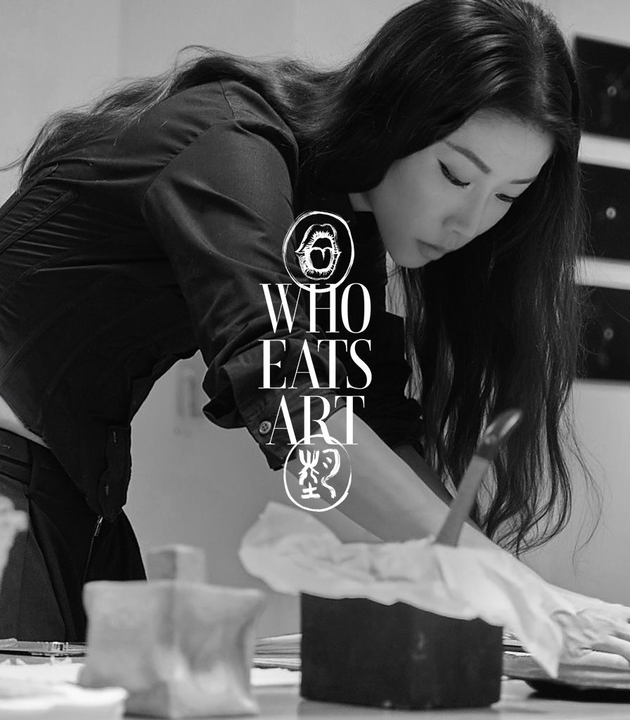
I brought out my brush, Chinese black ink, saucer, and kraft paper and began to look at the words Who (誰), Eats (吃), and Art (藝), tracing how they appeared as Hanzi and how they could transform when written repeatedly until they became something more abstract, more instinctive, and more alive.
② Keeping the mark, making it legible
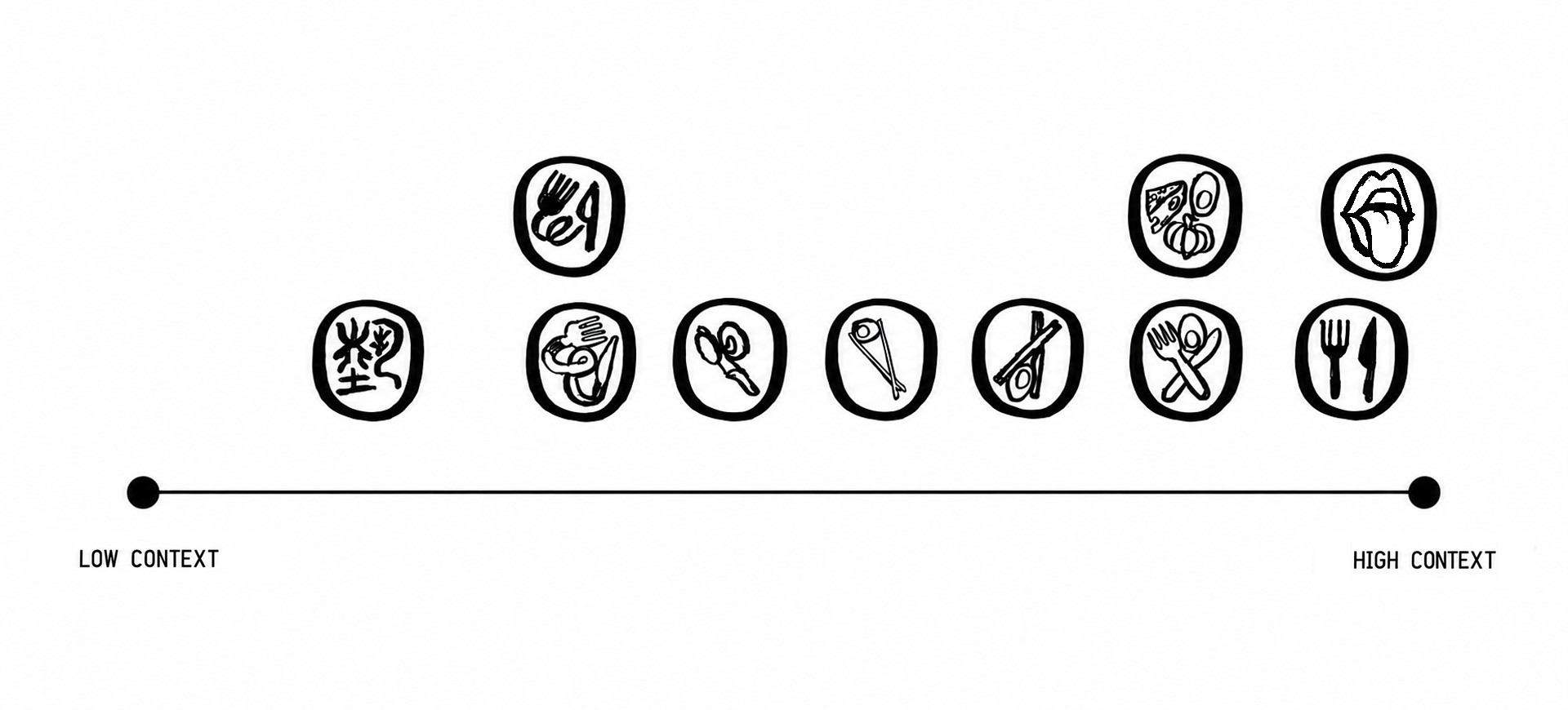
But 藝 alone is low-context: abstract, needing explanation, and rewarding only those who already know the brand. For a brand about eating art, that was not enough on its own. The system needed something that signalled food and sensation immediately, with no translation required.
This led to a second, parallel exploration of utensils, ingredients, and eventually a mouth-and- tongue mark—closer to a Rolling Stones tongue than a seal-script character. High-context and instant, it speaks directly to taste, and taste is the entry point into the sensory experience Who Eats Art offers.
③ Typography and application
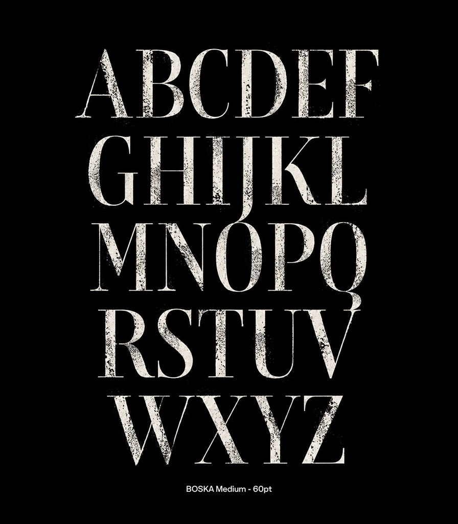
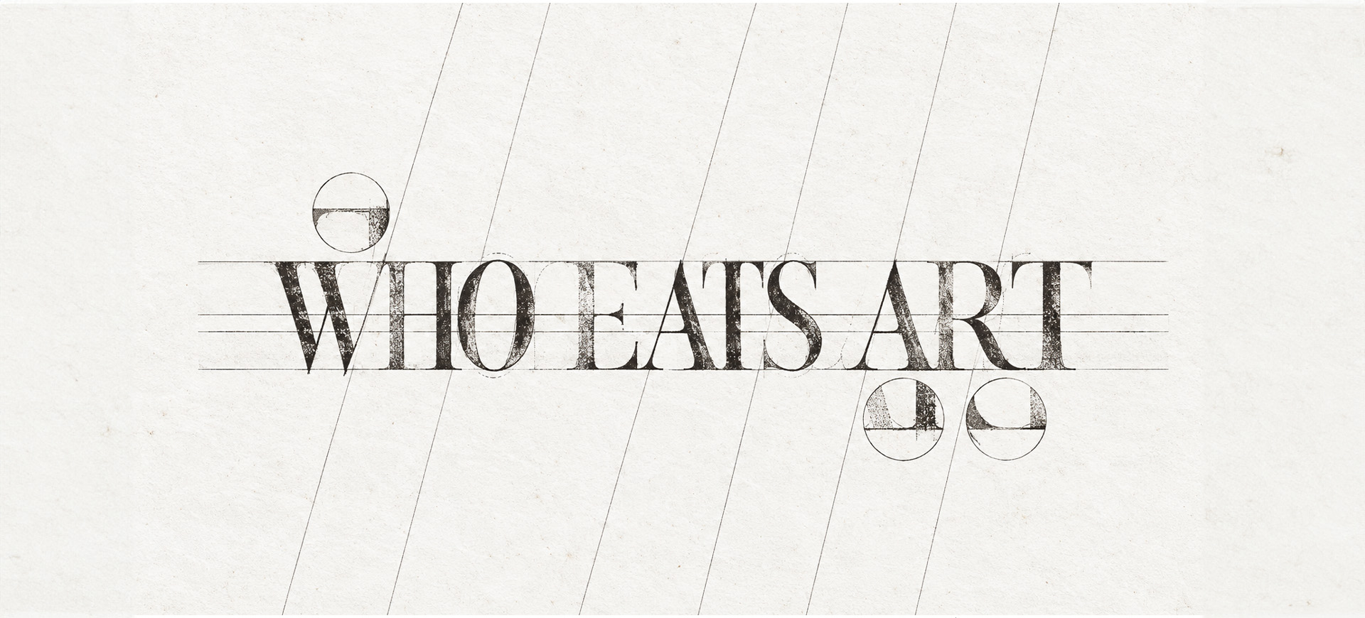
The wordmark was set in Boska, a serif typeface with a grounded, tactile rhythm that echoes the mark-making behind the identity. It gives the brand a formal base, while keeping enough softness to sit alongside the more expressive emblem.
Design Led by
Zarer Lim.
Commissioned by
Gong Hua, Artist / Founder of Who Eats Art.
Photo Courtesy of
Who Eats Art and Zarer Lim
If this tickles your creative fancy, let's chat zayrerboy@gmail.com

Copyright © 2026 Zarer Lim. All Rights Reserved.