Dumptruck
Type Design
Zine-making
Graphic Design
Project Type
Self-initiated / Experimental
Year
2020–2022
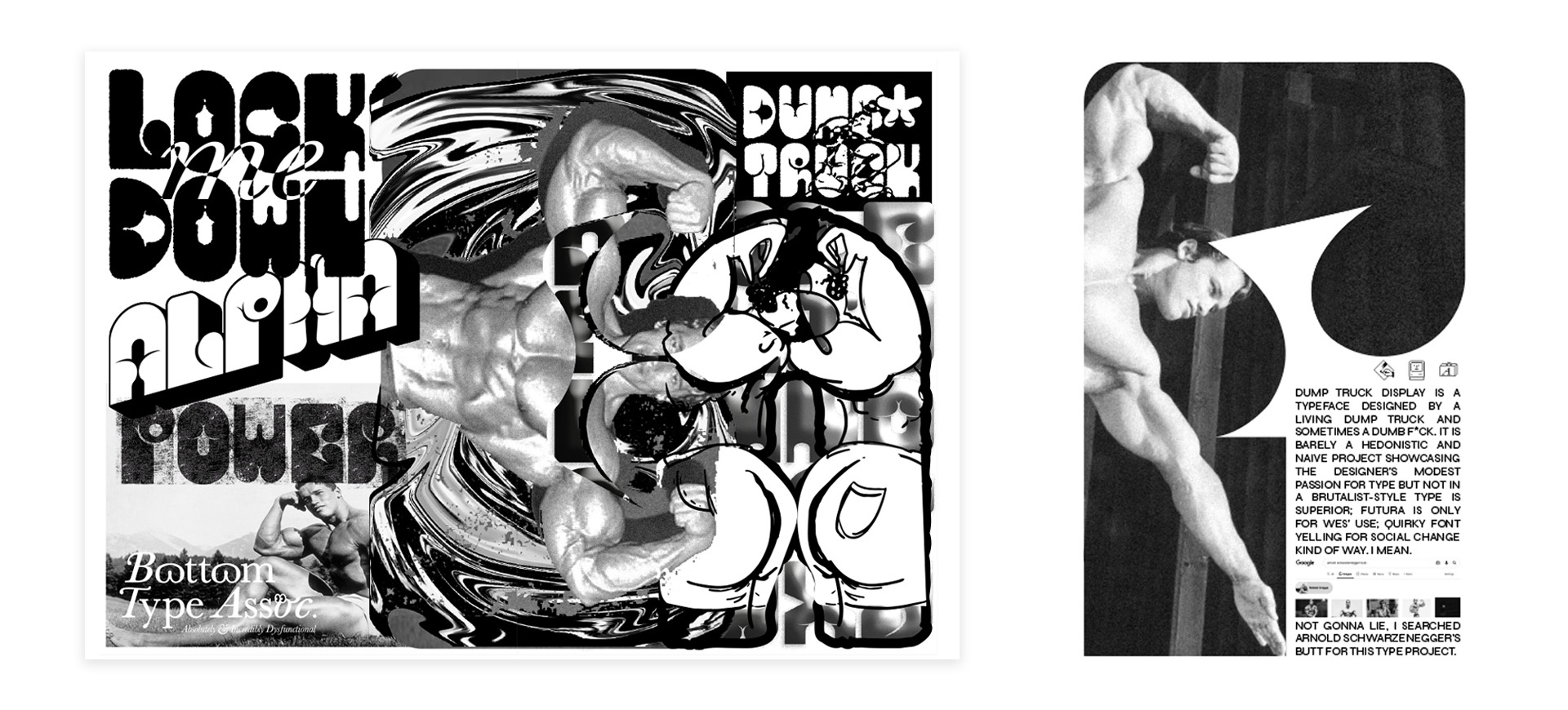
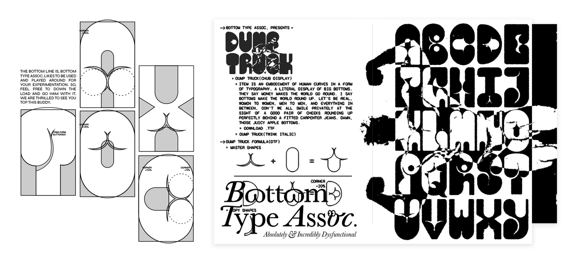
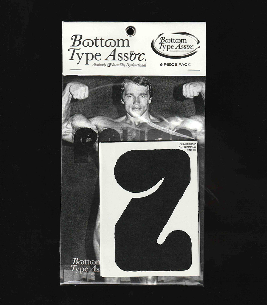
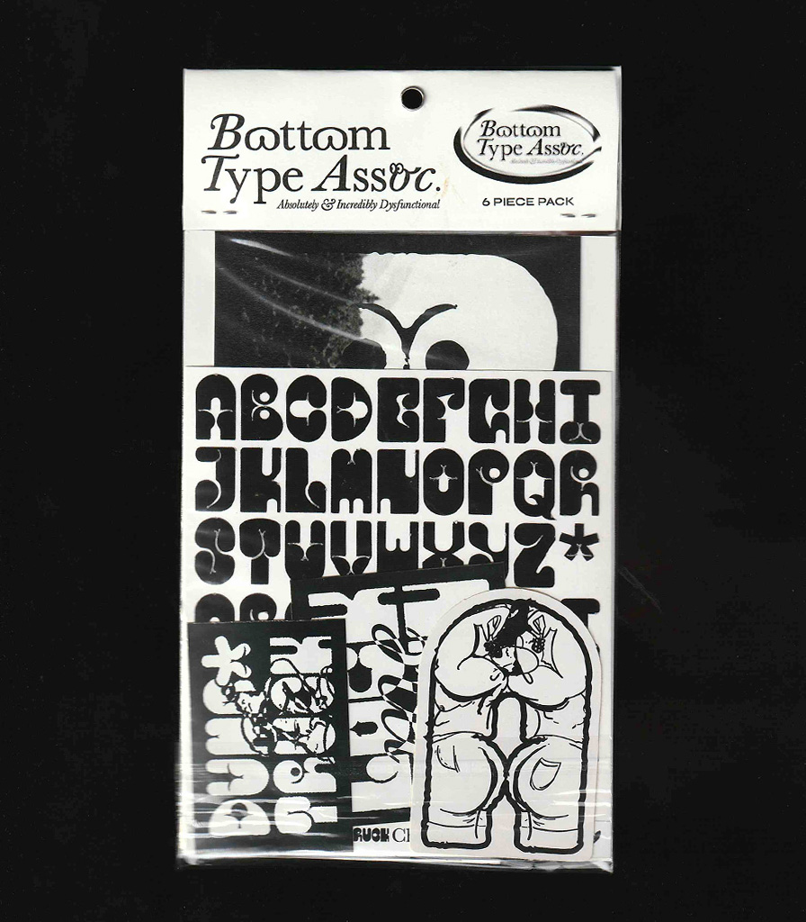
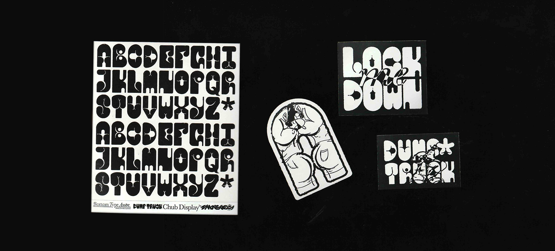
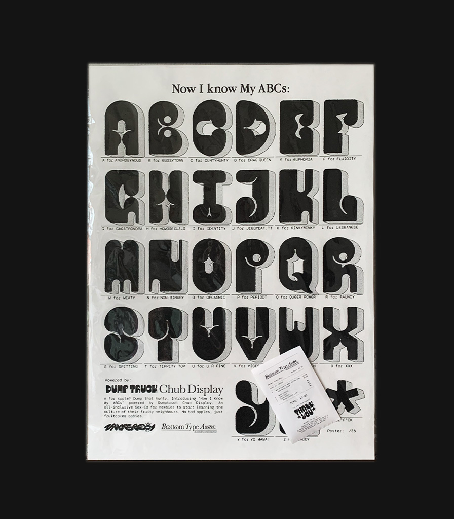
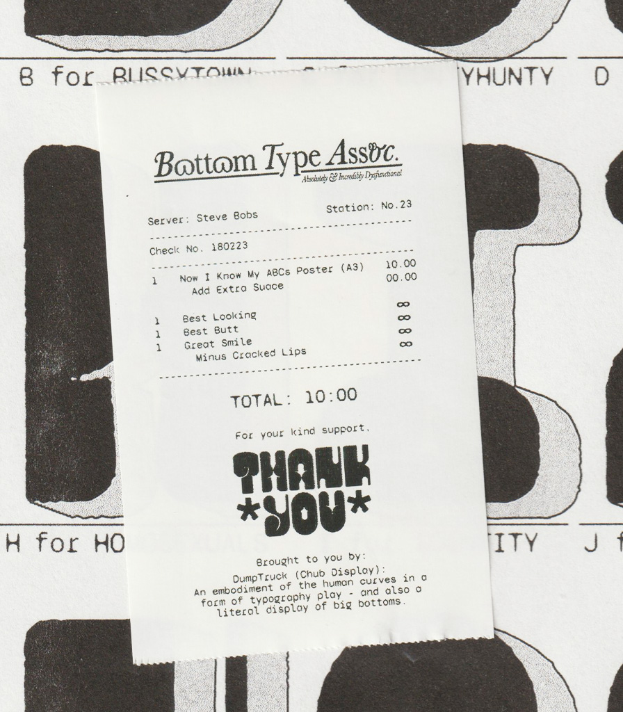
Dumptruck Zine is a graphic design exploration that began with one butt-shaped letterform and spiraled into a full-blown typeface. Equal parts absurd and affectionate, the project reimagines a speculative type foundry—where every glyph is a crack and every layout flexes like a bodybuilder’s glutes. The zine and poster playfully blur the line between typographic legitimacy and chaotic fantasy, printed with both DIY and risograph methods.
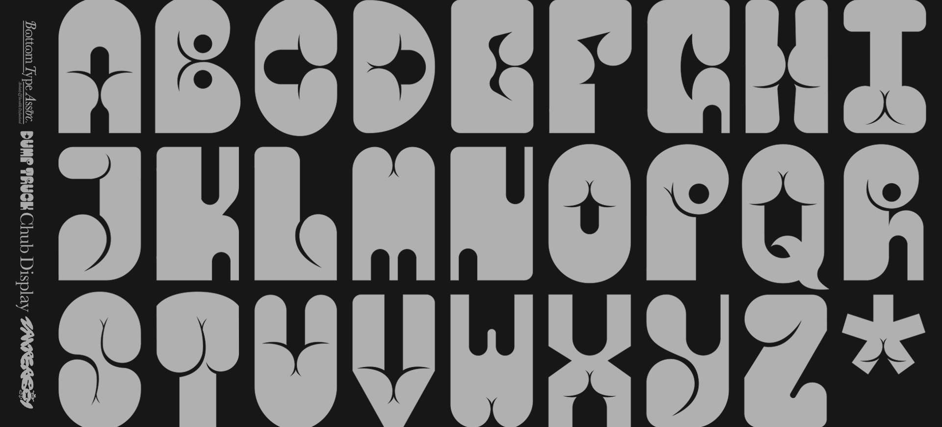
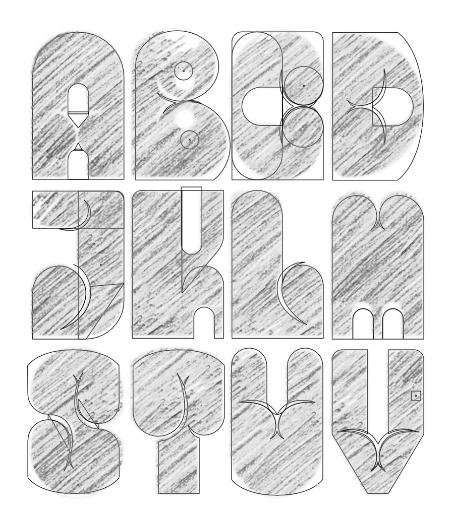
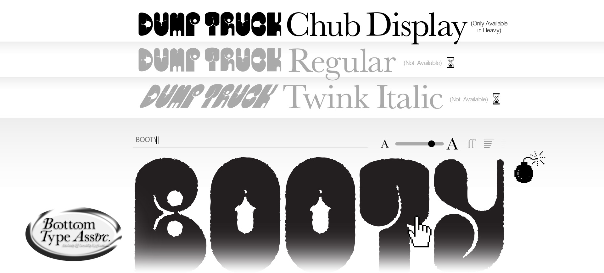
It all started with the letter A—or more precisely, two butts bumping purses. What began as a typographic joke evolved into a cheeky experiment in form and fantasy. Dumptruck is named quite literally: every glyph is a crack, every composition a flex. There’s no grand metaphor—just the joy of letting an absurd idea spiral until it started to feel oddly... credible.
The typeface soon took on a life of its own—asking: Am I serious enough to be a typeface? Or can I at least pretend? What followed was a dump of self-jabs, chaotic visuals, and a touch of delusion—all of which found their natural home in a zine. Printed through a mix of DIY and risograph methods, the zine and poster blur the line between typographic legitimacy and graphic nonsense, with love.
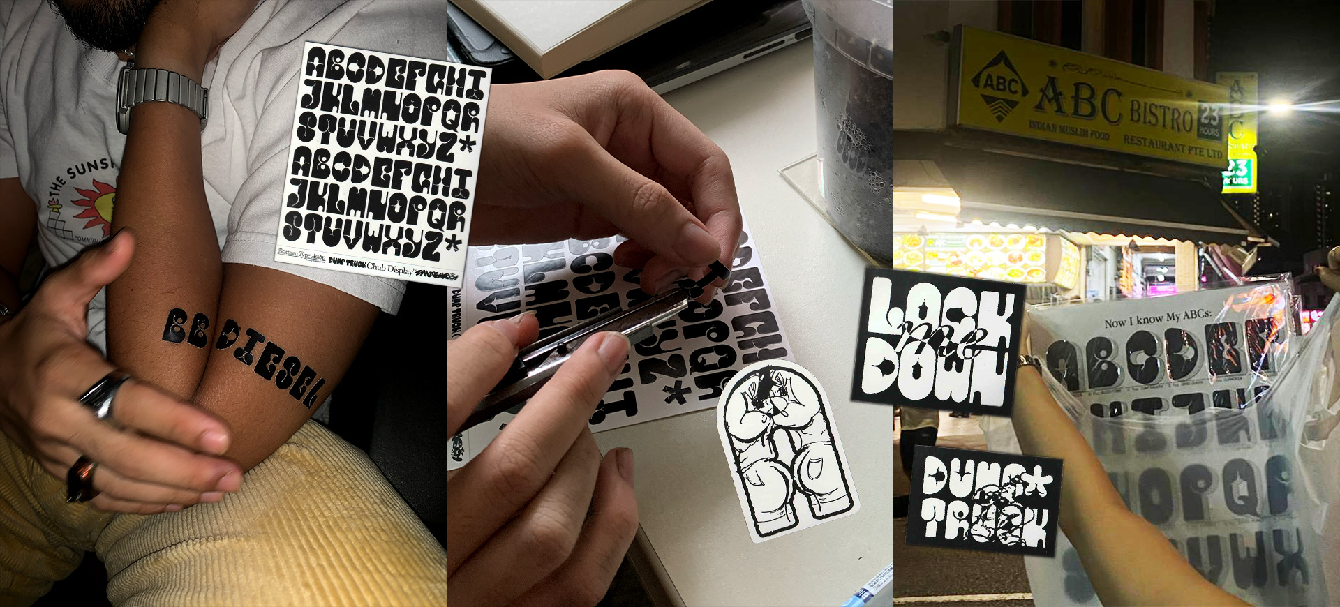
This self-initiated project eventually made its
way
into the real world—where Dumptruck Zine was
sold as
a pack of posters and stickers at local fairs
like
the Singapore Art Book Fair, EatSnake, and Cut
Copy
Paste. Altogether, I sold around 50 zine packs
and
over 100 posters. What began as a joke and a
graphic design exploration found unexpected joy
in the hands of strangers.
Designed by
Zarer Lim.
Riso-Printed with
Shrub
If this tickles you creative fancy,
let's chat
zayrerboy@gmail.com

Copyright © 2025 Zarer Lim. All Rights Reserved.